Kirlian Photography: Light, Pattern and Creative Exploration
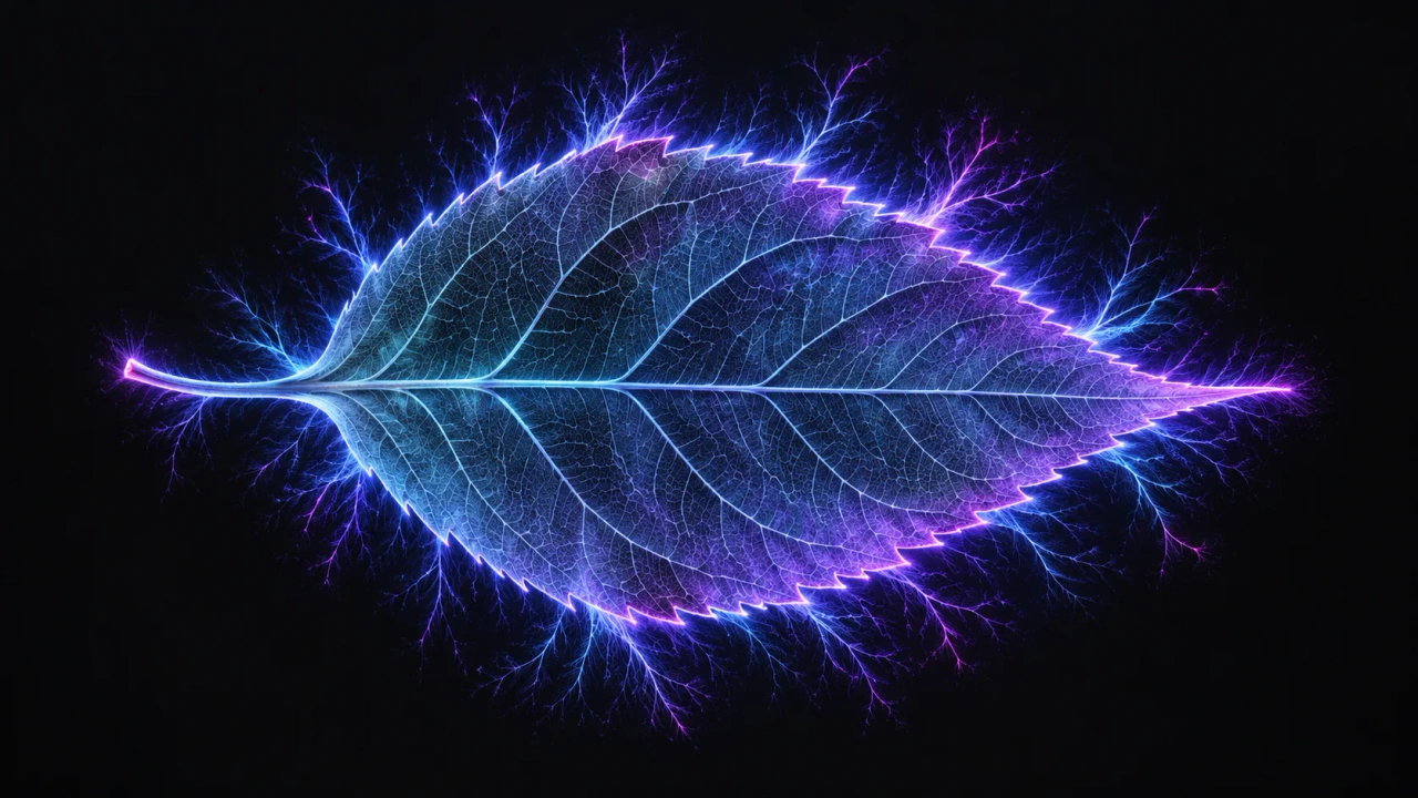
In aura traditions, luminous imagery can inspire thoughts about vitality and connection. Kirlian pictures also invite a different kind of attention: looking closely at shape, light and the space around an edge. You can appreciate those visual relationships without needing to settle on one meaning for the image.
Begin with a little context
Pehek, Kyler and Faust describe Kirlian photographs as records of corona activity during an exposure and report that moisture can influence image appearance. Primary research, 1976.
That context can sit alongside a creative response. When viewing a picture, give its documented origin a place in your understanding, then make room for the questions an artwork can open. What holds your attention? Where does your eye travel? Which detail would you like to spend more time with?
Find the shape before naming the story
Start by noticing the central form. It may look familiar at first, yet become harder to describe when you attend to its outline. Look for broad curves, narrow points, repeated angles or an uneven balance between one side and the other.
Try describing the form without immediately explaining what it represents. A tapering shape, a rounded center or a diagonal movement gives you something concrete to discuss. Once you return to the subject's name, notice whether that first visual description changes how you see it.
This is a way of slowing down your attention. A familiar object can become interesting again when its outline, rather than its everyday purpose, leads the conversation.
Let the edge become a subject
Move your attention from the center toward the boundary. In the image you are viewing, does the border feel compact, irregular, delicate or expansive? Look for places where a strong visual rhythm gives way to a quieter patch.
Then choose one small area and examine its relationship with the whole picture. A detail that looks dramatic on its own may play a modest role in the larger composition. Another detail may become the point around which everything else seems arranged.
If you are discussing the image with someone, compare the places each of you noticed first. The difference can be more interesting than agreeing on a single focal point.
Notice the space that surrounds it
The unoccupied parts of a composition deserve attention too. Look at the distance between the visible form and the picture's borders. Ask whether the subject feels enclosed, suspended, crowded or given room to breathe.
Imagine the same picture placed beside another with a very different arrangement of open space. One might gather your attention toward a dense center; the other might invite you to look across a quieter field. Treat these as descriptions of your experience as a viewer.
When selecting images for a presentation, leave room to appreciate their complete compositions. A close detail can accompany a full view, giving the audience both intimacy and orientation.
Explore color through relationships
Begin with the colors that are actually present in the selected image. Notice where they meet, where a small accent interrupts a larger area and whether the overall arrangement feels restrained or varied to you.
You might associate a color with a season, a place or another artwork. Someone else may respond mainly to contrast or repetition. Share those associations as personal responses, alongside a plain description of what you see.
A useful creative question is what would be lost if you described the image by color alone. Shape, spacing and scale may be doing just as much work in the composition. Let color deepen the discussion while keeping those other relationships in view.
Arrange a sequence with a point of view
A small sequence can invite a longer look than a single striking picture. Choose a few images that give you something specific to compare: repeated forms, contrasting amounts of open space or a shift from a full composition to a selected detail.
I would begin with an image that introduces the sequence's visual idea, follow it with one that complicates the pattern and finish with a picture that leaves an interesting question open. That is an editorial choice, not a required formula.
Try changing the order and noticing how your response changes. A quiet picture may feel like a pause in one arrangement and a strong opening in another. Give each image enough room to contribute, rather than asking every picture to compete for the same kind of attention.
Give the caption two clear jobs
A caption can identify the image and introduce your creative perspective. Keep those jobs distinct. Begin with the subject and the source or recording description that is actually available. If you are presenting a crop, a creative edit or an illustration, name that presentation choice clearly.
Then add a short observation that helps the audience look: perhaps an uneven border, a repeated curve or an unexpected relationship between a small detail and the surrounding space. A specific invitation is often more useful than a grand explanation.
Artistic appreciation and technical documentation can accompany each other while serving different purposes. Place supported process information where a reader can find it, and give your interpretation its own voice. An illustrative botanical cover, for example, should remain identified as an illustration.
Keep different visual formats clearly named
If a collection also includes AuraCloud® 3D examples, present those as a separate software-visualization format. Keep their captions and source descriptions specific to that material. The audience can appreciate each format more fully when the presentation makes its identity clear.
Continue exploring by choosing one picture and writing three concrete observations before offering an interpretation. For a separate conversation about digital visual sessions, ask about AuraCloud® 3D, or return to the Kirlian Cameras introduction.